Get Useful Insights Easier: Automate Cohort Analysis with Analytics & Tableau
Tuesday, March 12, 2013 | 10:44 AM
Labels: Advanced Topics, Analytics API
The following is a guest post by Shiraz Asif, Analytics Solutions Architect at E-Nor, a Google Analytics Certified Partner.
Cohort analysis provides marketers with visibility into the behavior of a “class” of visitors, typically segmented by an action on a specific date range. There are many applications and businesses that would benefit tremendously from cohort analysis, including the following sample use cases:
- What traffic channel yields the most valuable customers (not just valuable one time conversions)
- Customer life time volume based on their first bought item (or category)
- Methods for gaining and retaining customers and which groups of customers to focus on
- For content and media sites, understanding frequency, repeat visitors and content consumption after sign up or other key events
- Repeat Purchase Probability
If you read E-Nor President and Principal consultant Feras Alhlou’s latest post on cohort analysis in a cross-platform environment, and read until the very end, you saw a note about a follow up post on how to automate cohort reporting from Google Analytics in Tableau. This is what I'll outline in today’s post. Why the emphasis on automation, you might ask? Without automation, we end up spending more time than necessary on exporting/copying/pasting/massaging data which can eat up resources better used analyzing and optimizing.
In addition to report automation, data visualization is also key. Google Analytics offers amazing visualization, including the recently announced dashboard enhancements, but at times you also want to view the data and trend it or merge with other sources. For this, its best to use tools available in the Google Analytics Application Gallery or a BI platform like Tableau.
With the introduction out of the way, following is a step-by-step guide to automated, cohort analysis with Google Analytics and Tableau:
1. Cohort Data Elements in Google Analytics
If you have your cohort data elements already captured in Google Analytics, then skip this step, otherwise, this post is on setting up cohort data in by Google’s Analytics Advocate Justin Cutroni is a must.
2. Tableau version 8 (Google Analytics connectors)
In order to automate reports, you need to have Tableau version 8, since this is the version that has a Google Analytics connector (works well, although still in beta).
3. Data Import from Google Analytics Into Tableau
- From the Tableau home screen, select Connect to Data, and then pick the Google Analytics connector. After authenticating to Google Analytics, you'll be prompted to select your Account, Property and Profile, if you have access to more than one.
- Set up the data import to get your Custom Variable key (e.g. CV1) and Date as dimensions, and Revenue as a Metric.
4. Tableau Cohort Analysis Configuration
- Change the format from Google's 20130113 to a Tableau DATE format. Since the date was stored in a custom variable, it was stored as a string. So that Tableau can treat this as a date, we need to convert the string to a date format. This was done by creating a new Calculated field in Tableau. We called the field "Cohort Date". The formula below worked for our purposes but would require some tweaking for larger datasets.
- Now that we have the date in the format we want, the next step is to subtract the cohort date from the transaction date. To do this, we created another calculated field called "Days since Signup". The formula for this field was simply:
DATEDIFF('day',[Cohort Date],[Date]).
Important: Tableau natively treated this as a "Measure" since it is a number. However since we're going to be graphing this on the X Axis, you should drag it to the Dimensions pane.
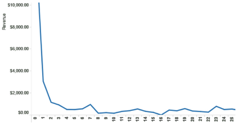
- Drag the Revenue measure to the rows Rows tab. Now drag the Days since Signup to the Columns tab. You should see a long graph similar to:
- Drag the Cohort date to the Filter pane, and select the cohort dates you'd like to visualize. For ease of use, I suggest, select only a few to begin with. Drag the Cohort to the color shelf to enable color coding of individual cohort dates.
- Now let's make a couple of adjustments to make the visualization more useful. In the color shelf, click the down arrow next to Cohort Date, and change the default display from Continuous to Discrete. Then, in the same field, select Exact Date instead of Year.
Voila! Your final view should look like this:
There you have it. With a few steps, we’ve pulled data from Google Analytics via the API using Tableau, massaged the data and then created a very insightful visualization. With this work now done, the graphic can be easily updated/refreshed. This takes the manual and mundane work of setting up the graphic and automates it so we can spend more time analyzing the data and finding hidden insights for our clients.


No comments:
Post a Comment